I felt ashamed about my app design, so I had to make it beautiful
I'm a software developer, not a designer. I went into this knowing that. But I spent a full day on styles before the first post, asked my girlfriend what she thought, and she said it was pretty.
She was lying. She always does.*
I published it. Read it again the next day, opened X, and spent twenty minutes scrolling through other people's apps. That was a mistake. By the end I wanted to throw my phone.
Everyone's app looked better than mine. Not a little. A lot.
So I closed Twitter, opened Cursor, and started over.
How do you make design decisions when you're not a designer?
The honest answer: you cheat.
You look at apps you admire, steal the ideas that fit your context, and throw away the ones that don't. This is how design works. The only difference between "research" and "copying" is whether you admit it. Designers do it all the time, I learned from the best.
But before you can steal anything, you need to know what you're stealing for.
HealthFactor is for biohackers, not casual wellness users. People who track testosterone levels, inject peptides at 5am and argue about HRV measurement methodologies on Reddit. That persona does a lot of work.
Dark mode is non-negotiable. Dense information is a feature, not a problem. Power users don't want things simplified, they want things fast. Glass, gradients, and subtle glows say "this is sophisticated", which is exactly the ego stroke the target user needs.
Once I had the user clear in my head, most of the visual decisions made themselves. The hard part wasn't knowing what to aim for. The hard part was being honest enough to admit how far I was from it.
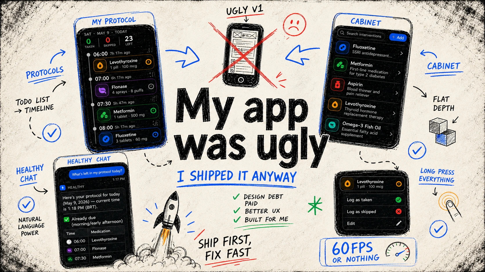
Protocols
The Name
The medications page had a foundational problem that no redesign could fix: it was called "Medications", and it wasn't just for medications.
Biohackers don't only take medications. They take vitamins, peptides, hormones, amino acids, adaptogens. Half of what's in the app doesn't have an ICD code. Calling the page "Medications" was immediately wrong for the audience I was building for.
I tried "Medications and Supplements." Too long, immediately ugly. I spent days on this and found nothing that worked.
Then I asked Claude. It came back with Protocols.
Protocols is broad enough to hold everything, from what you take to when you take it. It also reframes the mental model: you're not tracking medications, you're following a protocol. That's the biohacker framing. Medications became Interventions for the same reason, because that's what they are: interventions in your body's baseline.
The Header
I wanted Apple's Large Title. That specific scroll-to-reveal behavior, the way it makes a page feel native and grounded.
The problem: Expo's Large Title implementation dropped the app from 60fps to a stuttering mess the moment you scrolled. Not a minor performance hit, it was visually broken. Not acceptable.
So I built it myself. Not a heroic choice, just the only option left.
The result is better than what I was trying to copy. The header shows two things: when and how much. Today's date or a custom date, and your progress: taken, skipped, left. Three numbers. That's all you need at 6am when you're trying to figure out if you've taken everything.
The Timeline
The timeline was the thing that broke me. Not technically, the layout was fine, but the feeling was wrong.
It looked like a to-do list. A plain, flat, forgettable to-do list. Biohackers don't follow to-do lists. They follow protocols. The UI needed to reflect that without me having to explain it.
I tried to bring Liquid Glass into React Native. The real thing doesn't translate directly, but close enough works: every icon glows slightly, pops against the background, draws the eye. Medical and futuristic at the same time, which is exactly right.
Context menus on everything. Long press on any card and you get actions. No need for navigation, no modals, no extra taps.
The Cabinet
The Cabinet, where all your interventions live, followed the same design logic. Same language, lower intensity.
The one non-negotiable addition: search. With 17 interventions in the test database alone, browsing a flat list was already painful. Search now works across name, description, and category. Fast, local, no delay.
Chat
The chat page had the biggest before/after gap of anything in the app. Before: flat, functional, looked like a prototype someone forgot to style.
The structure didn't change, just native SwiftUI header and footer, React Native body, ExpoUI components where they earn it. What changed was the execution. Liquid Glass on the native parts. Gradients and depth on the RN side. I pulled references from ChatGPT, Grok, and Gemini, and combined them into something that felt like mine.
Sidebar drawer for conversation history, folders, full-text search. Animated through Reanimated. The empty state got proper attention too.
Chat Composer is what I call the footer, the input area where users can type messages or attach files.
For files, the first decision was obvious: local storage only. This app is about personal health data. No third-party cloud.
But local has a problem. User uploads a 50MB PDF, uses it in a chat, then deletes the file from their phone. Now the chat references a file that doesn't exist. The simple fix is caching, just keep a copy in the app's storage. But if the purpose of the app is to upload multiple large documents, the app grows proportionally. That's not a solution.
My server already has plenty of storage. I set up Garage and called it done.
Then came the actual hard part.
ExpoUI's SwiftUI input component doesn't support paste-to-upload. So I had to build a custom SwiftUI component that did.
GPT-5.5 wrote it in minutes. I tested it and it worked. Then I turned on the performance monitor.
0 FPS on paste. 0 FPS on upload complete. The app froze solid, twice, in the same interaction.
So I did what I hate most: debug performance in a language I barely know.
After a lot of debugging, the cause was clear: everything was happening synchronously on the main thread. The Objective-C code, the bridge, the TypeScript handler, all of it, main thread, sequential, blocking.
I redesigned the TypeScript upload pipeline into a multi-step queue that could run off the main thread. The result: 60fps.
The chat has one serious unsolved problem. When the AI is streaming a response, two things happen:
- Performance tanks.
- Manual scrolling stops working.
The second one I genuinely don't know how to fix yet. The first one I traced to a single cause: Markdown.
The agent streams Markdown. Parsing Markdown is not cheap. And for every new token, the entire document has to be re-parsed. You can't cache partial Markdown because it's structurally incomplete until the stream ends.
I found a library that claimed to solve exactly this problem by running the parsing in a worklet instead of on the main thread. I installed it. It didn't work. I asked GPT-5.5 to fix the errors. Two hours later, every fix revealed a new error.
I checked the issues. There was a month-old open issue: the library is completely broken with current dependency versions.
So I did what any reasonable developer would do and read the source. The whole library was under 300 lines. It was essentially two existing libraries merged into a single hook. Easy enough.
I rebuilt it from scratch in about two hours, using the original as a reference, fixing what was broken, adding my own optimizations. It worked. It ran off the main thread. The JS thread was no longer the bottleneck.
The UI thread was the bottleneck.
Rendering large Markdown blocks still caused FPS drops. Rendering a partial table, one that's mid-stream and structurally incomplete, froze the app for seconds at a time.
Since I owned the library now, I added table buffering: don't render a table until the stream closes it. Instead of a 3-second freeze, a 1-second freeze. Progress.
Then I asked GPT-5.5 to write a fast table renderer specifically for this library. It did not work.
I still don't know how apps like ChatGPT handle this. I don't know if they avoid streaming Markdown entirely, if they buffer it or if there's a rendering trick I'm missing. This is the open problem. I'll figure it out, and if I can't, I'll rip out Markdown and build my own renderer.
The app I actually want to use
The streaming is still broken. The list of things left is still long.
But I open this app every single day. I log my protocols, I run natural language queries against my health data, I argue with the AI about my health. That's dogfooding, and it means the foundation is there.
The visual debt is paid. What's left is the interesting part.
Next: Body Composition.